White Pocket 2019-10-06
During my mini-vacation from work to complete unpacking, I also took a bit of time to do some things for myself. As you might have guessed, that involved looking at and working on photographs. So here’s the first of what I hope are many to come of my return to photographs posts.
I decided to revisit just one day of our 2019 fall vacation images and just thinking about the trip, it was easy to select the day we photographed in White Pocket to look for an image I might want to work on. I’d selected several images for the trip blog posts, and as I skimmed through the images from that day, I realized why. They were easy images to appreciate. When time is of the essence (i.e. “Get the damn blog post out!”), I tend to grab the visually striking images that may not require as much work as other images.
I didn’t want to just re-do an image I’d previously worked on, so I started scouting out for viable alternatives. It wasn’t easy. With many of the images I had to struggle to figure out why I took them (never really a good thing), others, the why was obvious but the image itself was unsuccessful. Still, I kept looking at images, pausing at some to think them through, knowing that there would be something that shook me up enough to get myself to commit to the image.
Not long after I started wondering whether I’d find anything of real value, I came across this image. The image below is almost a straight out of camera image. I say almost because I use an exposure technique called “expose to the right” that is useful for digital photography. It refers to using your histogram to try to record the maximum amount of detail possible, but to not over expose the image (overexpose and the sensor can gather no additional information in the lighter tones and you have nothing but pure white regardless of the actual tone of the object). The advantage is that you get as much detail as possible in the shadow areas. So, often the straight out of camera image looks a bit bright and you have to pull down the exposure a bit. The only thing done to the image below is to lower the exposure just a bit (0.91 stops to be precise).
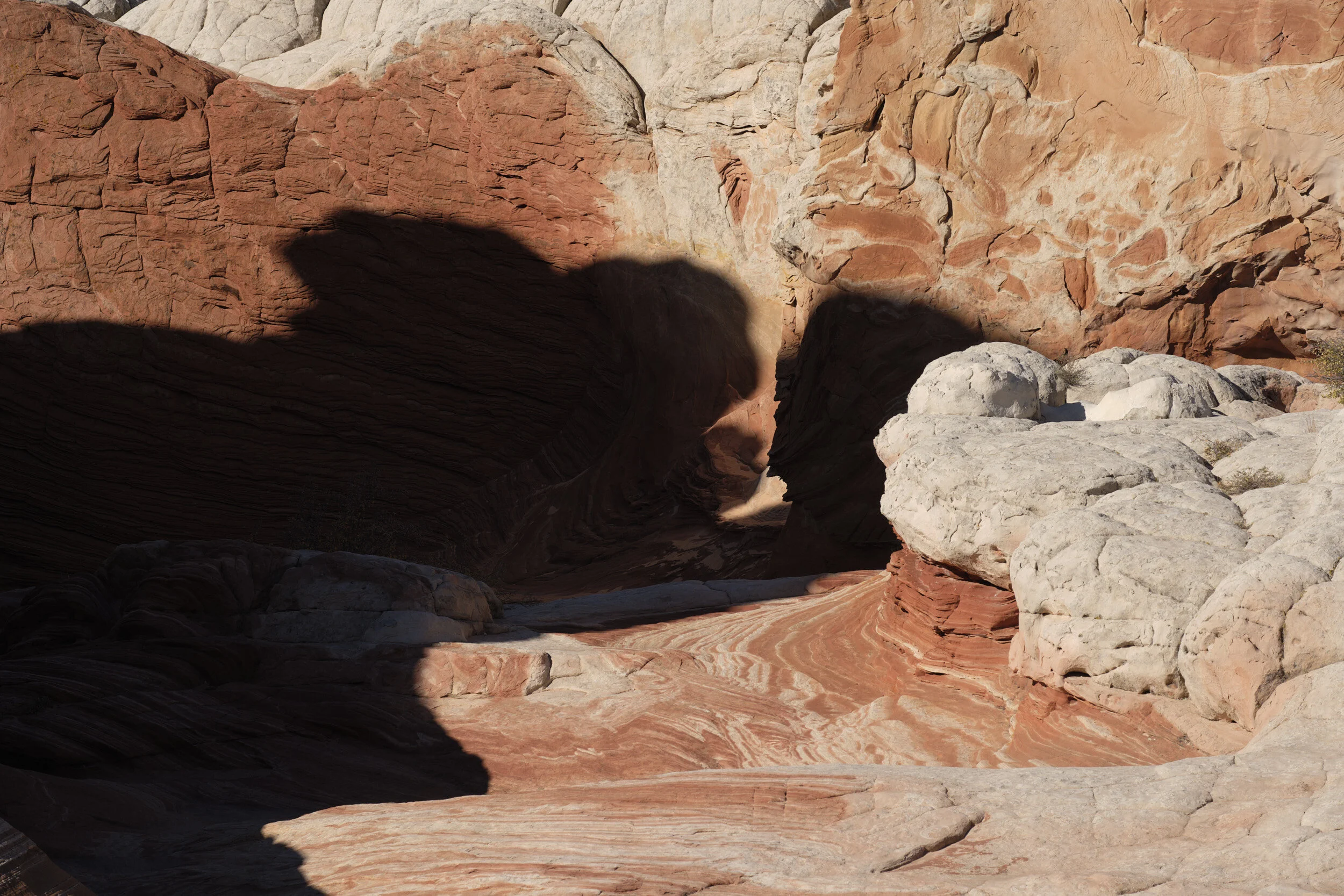
First off, I knew that this was not what I was thinking when I made the image. If you look at the left hand side you can see an odd, somewhat lit portion of rock jutting into the bottom left corner, and up towards the top, an odd triangular shaped form along the edge. I absolutely would have seen this out in the field and would never have included such distractions as a part of the composition. So I knew I was thinking of something other than that.
One of the unfortunate changes Fuji made between the X-Pro 1 and X-Pro 2 is in how they lay out the menu on the LCD screen. On my X-Pro 1 I had actually laid a piece of black gaffer’s tape over the LCD screen so that the format of the image was 5x7 instead of 2x3 (I really don’t like the linear feel of 2x3 [which is why my point-and-shoot is so nice to use, it’s 3x4]). On my X-Pro 1 I knew to disregard the right hand edge of the image when looking at images on the computer. On the X-Pro 2, the menus appear on both sides of the screen, so I had to abandon the gaffer’s tape approach. Sometimes in the field I have to visually obstruct an edge to re-create a crop I might want. Doing that, of course, doesn’t change the proportions of what is recorded on the sensor. Now, the camera allows for me to do a square crop, which shows as a square on download, but the only other options I can set in-camera are the normal 2:3 and the video-based 9:16 (I think). [Side note to Fuji - your medium format cameras allow for a wide range of formats (5x7, 4x5, etc) why don’t you add it to your smaller cameras, it’s only software!].
Even though the image wasn’t intended to be square, I decided to crop it square where I thought it should be. There was something there!
But then a whole range of issues popped up that made me quickly realize that I really should expect nothing more than this to be a learning exercise, and something for me to simply enjoy the act of doing. Not to make excuses, but the fact is I really have not worked a lot with the software recently. I’m pretty amazed I was able to get the results I did from the Homage to Charlie Waite blog post, but that was easy compared to this. How long has it been since I’ve really worked images? Well, we’ve since upgraded to Capture One 20 (with a few new tools I have no idea how to use), and this week Capture One 21 was announced for pre-order. Like the darkroom, developing an image takes a lot of skill that must be honed and kept in shape by practice. I’m way out of shape at this point. Plus, my monitor is not calibrated (nor can it easily be done). So my values may be way off. All I can do is try and make the picture look good and hope it comes out well online in the blog post. All of that will have to change (and will) before we start printing.
Back to the image . . . . I quickly realized that the image might be appealing in black and white, so I made a virtual copy (called a “variant” in Capture One) so I could work on it in B&W and in color.
As you can see, I cropped it to focus on the stark shadow element and the mirroring curves and rock faces.
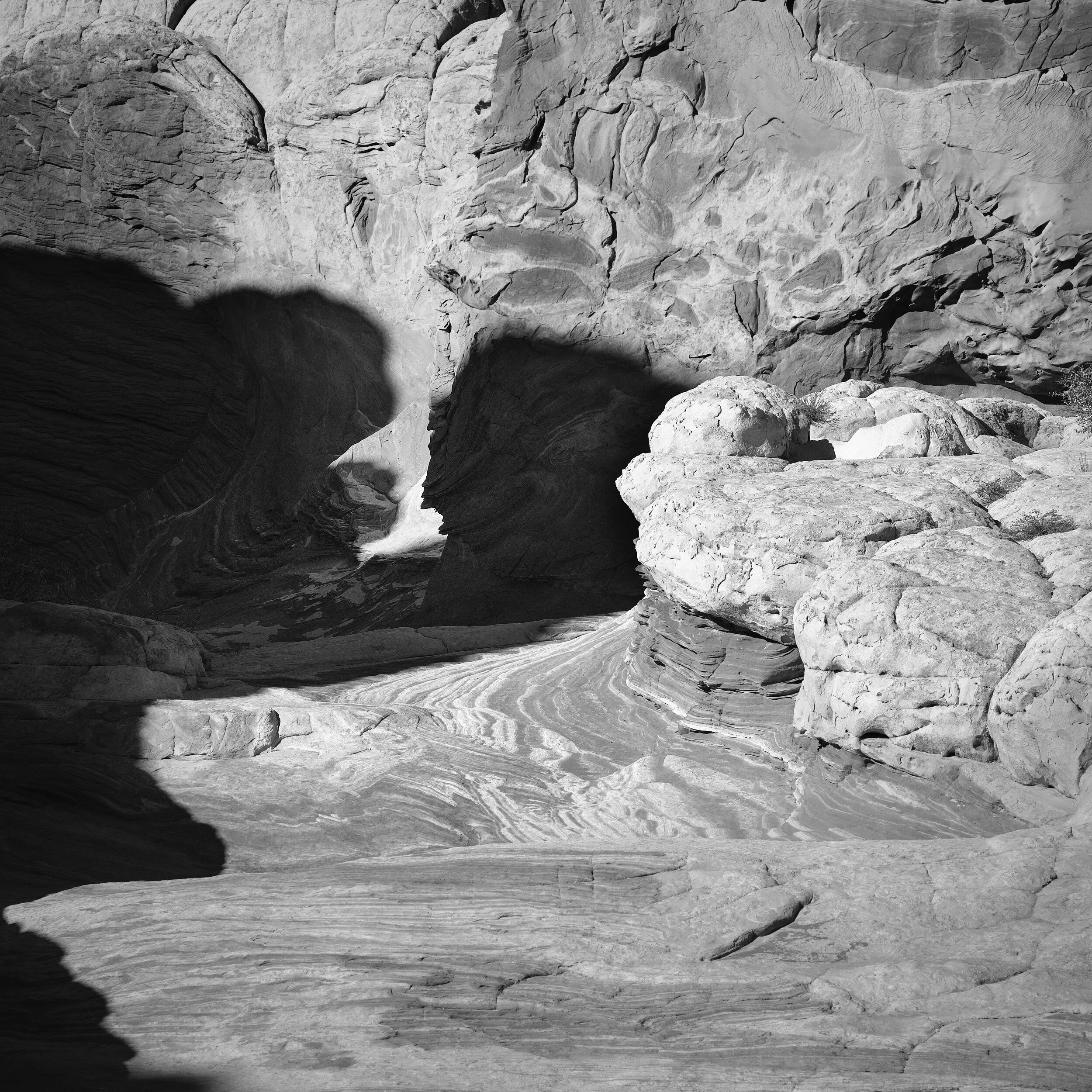
Working on the image made me realize how rusty I was with not only my technique, but my decision-making. I used to tell folks that the hardest thing in the darkroom isn’t the skills or techniques - even when you have to do 7 or 8 different things during a 20 or 30 second enlarger exposure. The hardest thing is the decision to do one thing instead of another. The fact I’m out of that practice became quickly evident. It was easy to go too far, or go far enough. Then add to the fact that the above image looks entirely different on my large monitor (not far enough) than it does on my laptop (maybe just a bit too far in one place), and you’re left with having to settle for “good enough.”
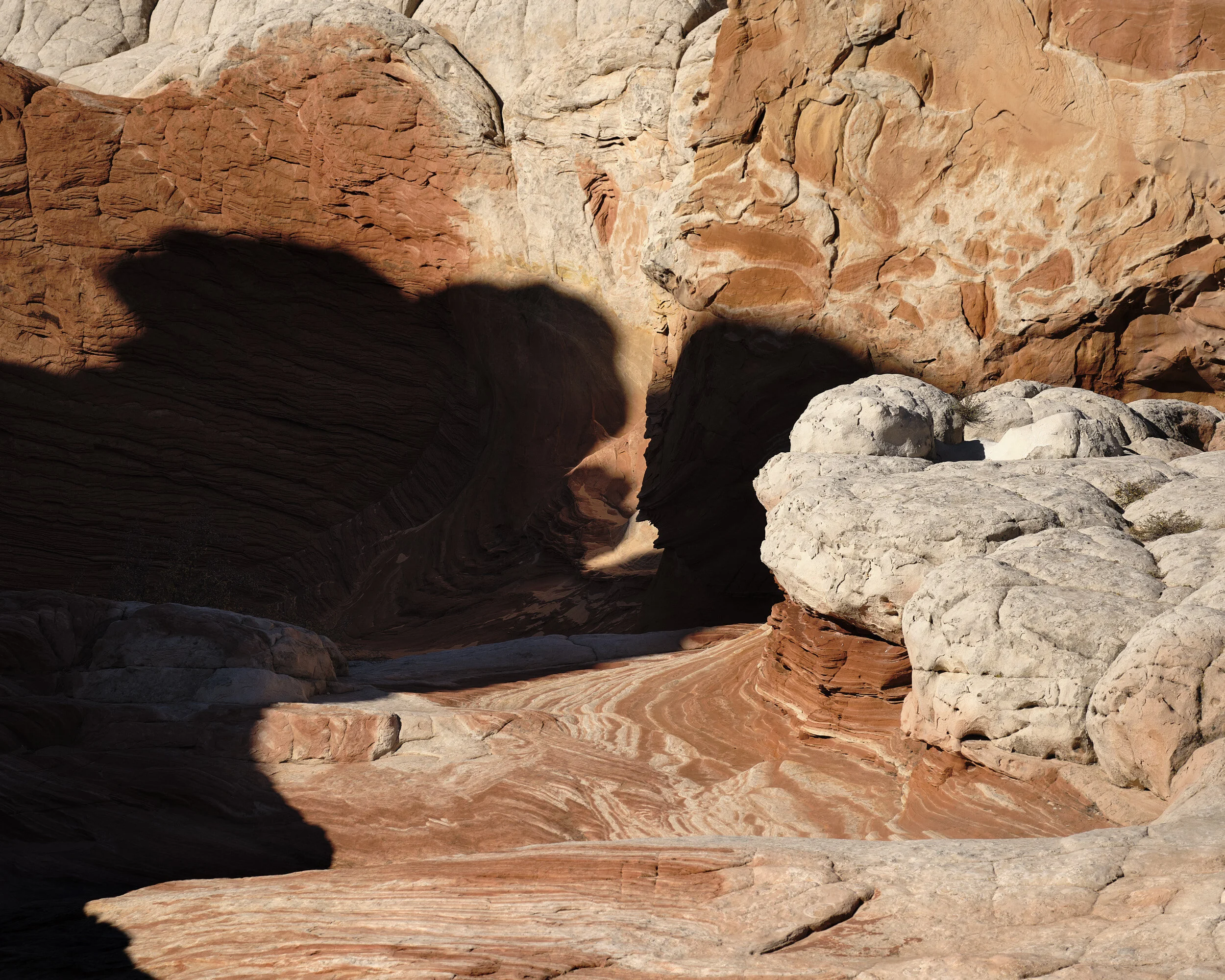
Once I was satisfied with the B&W image (on my laptop) I then went back to the original variant, and realized that the color made things so much easier. I managed to achieve much of the same feeling with much fewer adjustments than I did with the black and white image.

Now I’m wondering how the images would compare if printed.
As I said, I’d come to accept that this session would be a learning experience. To be totally open, I returned to the images the next day (while writing this) to get the top image (for the story) and the image below (to actually work on), taken not from the same image used for the square images above, but from other ones in the sequence.
The first, as I noted, was a base image - what I started with in the original 2:3 format ratio. I decided to also see if there was an image that was there that was not square that I was seeing at the time. I eventually found it (at 4x5), and decided to develop the image, which is the one below.
And if I had to say, I think this is what I was trying to photograph at the time I made the images. I often make multiple images of the same thing - a throwback from the film days (especially my 4x5 days) where you might have dust on a negative or some camera shake with a long exposure. And pixels are free, so why not make a second or third shot just in case? The first and last images above were taken from a sequence of 4 exposures of the same image.
Before that, I had a couple of images, which I then adjusted the camera a bit to eliminate distractions from the top edge, then the four. The middle two images (the square ones) came immediately afterwards, after moving the camera backwards just a bit and keeping roughly the same top edge but including more foreground (compare the foregrounds and the blurred shadow element to see the differences). It wasn’t much of a move, but I moved backwards nonetheless.
In the end, I’m glad I returned to the images and wound up with the bottom image. I think that’s probably the strongest of the images. What do you think?